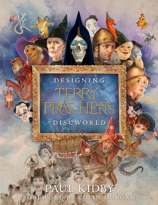
We picked up a copy of Designing Terry Pratchett's Discworld when we visited Bristol Waterstones for a talk back at the beginning of December. Life being life I didn't get to actually read the book until the festive period. I sat down and read the book from cover to cover but I suspect that this really isn't the way it is designed to be read. I feel that Designing Terry Pratchett's Discworld is more of a table-top book that you pick up and read in small chunks.
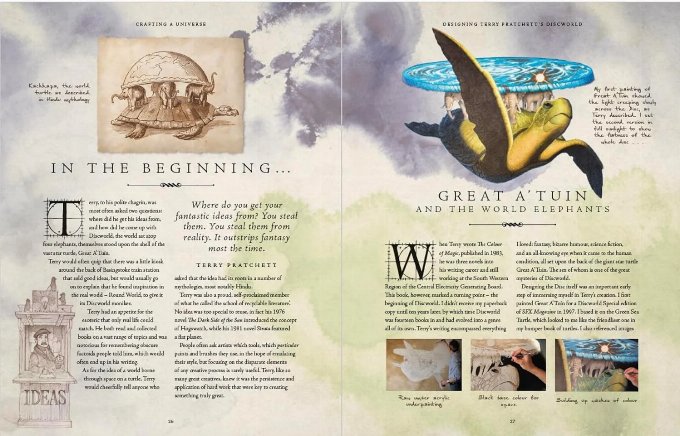
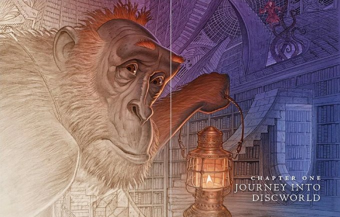
Obviously being a book about designing the Discworld the book is very image heavy and Paul Kidby's lavish illustrations feature throughout.
The book starts with a foreword by Colin Morgan (you may well know Colin from BBC TV's Merlin or one of the voices of the new audiobooks). It is fairly well know that Colin has been a Discworld fan for some time. I think earlier in his career he would have made an excellent Mort, though looking through the book it appears that Paul decided he would be a good model for Bilious (The Oh God of Hangovers) see page 191.

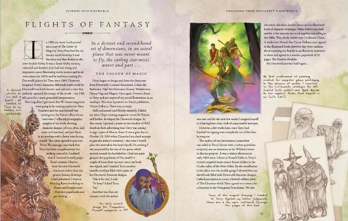
Before Paul landed the role of artist of choice for Terry Pratchett he worked as a jobbing artist for designing amongst over things the Um Bongo juice box and various computer game magazine covers. One wonders how many Paul Kidby illustrations we all saw in the early 90's without realizing they were his work.

The book goes on to tell how Paul tried to get his art to Terry several times before eventually taking an envelope stuffed full of illustrations to a book signing where he was able to pass his art over in person. Terry loved Paul's interpretation of the characters but at that time was loyal to Josh Kirby. (He did allow Paul to sell his art prints at the 1998 Discworld Convention in Liverpool - where apprentice Paul met master Josh).
When Josh sadly passed in 2001 a new artist was needed and Terry remembered Paul's art and invited him to visit. Terry was working on a book at that point named Forest of the Mind. Terry and Paul discussed the story and Terry invited Paul to come up with a cover design. Paul decided to base the cover on Rembrandt's The Shooting Company of Frans Banning Cocq and Willem van Ruytenburch, commonly referred to as The Night Watch. Paul painted in the various Discworld characters and even included Josh Kirby in the back row. When Terry saw the treatment and realised the title, he immediately changed the name of the novel.

So Paul and Terry's relationship certainly quickly developed into a two way creative process each feeding off each others imagination.
It's clear that Paul loves to create Discworld parodies of famous works. Night Watch being the first example. Designing the Terry Pratchett's Discworld goes into great detail about many of the parodies Paul has produced over the years. I'm not a great follower of art so many of the parodies are new to me. I wonder how many you would know (without checking first?).
It's truly fascinating to see how Paul's illustrations have developed over time. Paul is always looking to refine his characters, each time he redraws them he tries to make them more anatomically correct. Paul admits that in the early days of the Pratchett Portfolio (a great book if you can still get it) some of the characters are more caricatures than characters. One wonders though if Terry would approve of these changes, given the original sold the characters to him in the first place.
The book covers the full spectrum of characters, locations, covers etc. and features art from the very early days to some cover ideas from the books that Terry never got to write. Before the hard drive with Terry's works in process was destroyed as list of several book titles was released. From these titles and ideas, the Pratchett estate thought it might be fun to investigate cover ideas. They make for fascinating viewing.
One of may favourite parts of the book is the revelation (at least to me) of the badge numbers of two members of the watch. We all know that Vimes' badge number is 177 as it is recorded in the Discworld texts. But could you tell me either Carrot's or Colon's badge number? I am sure I didn't know them before. Not only do we get to find out these badge numbers but also why they were chosen. I'll leave it up to you to discover this information for yourself.
If you are a budding artist you may find the section twelve very interesting. It talks about the creative process, the creative space and the art supplies that Paul uses to create his works. I'm no artist but I still found it very interesting.
My only complaint about the book is that at times I wish Paul would go into more detail in some of his descriptions. Sometimes I felt that I was just scratching the surface of the details and I wanted to know more.
Designing Terry Pratchett's Discworld is, as Rob Wilkins says in his afterword, the first move towards a Discworld encyclopaedia. Designing Terry Pratchett's Discworld is a must for all Discworld fans that are even remotely interesting in the art of Discworld.
You can order Designing Terry Pratchett's Discworld by Paul Kidby using our affiliate links below: